Dashboard Overview Screen
Component Breakdown
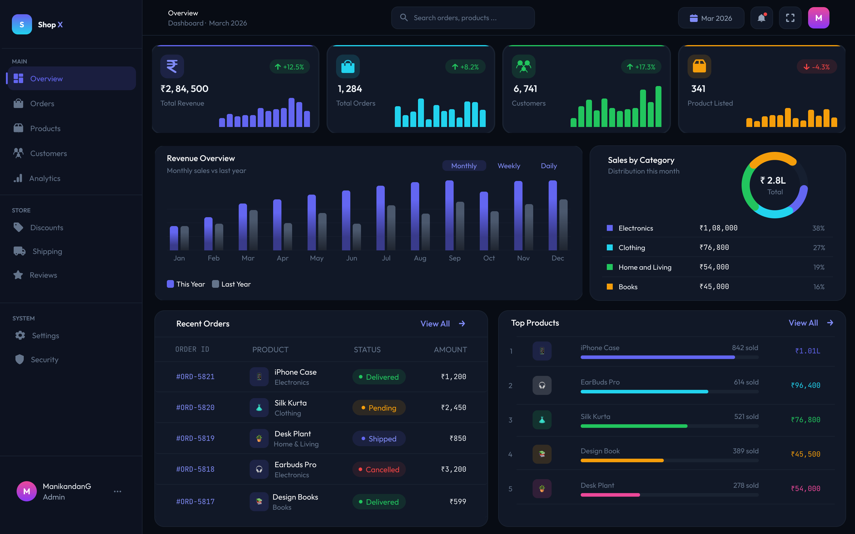
Sidebar Navigation
Grouped into Main, Store, and System sections. Active state highlighted with accent color. User profile pinned at bottom.
KPI Stat Cards
4 cards — Total Revenue ₹2,84,500 · Orders 1,284 · Customers 6,741 · Products 341. Each shows % change with mini sparkline chart.
Revenue Bar Chart
Monthly vs last year comparison with Monthly / Weekly / Daily toggle. This year in purple, last year in grey.
Sales Donut Chart
Category breakdown — Electronics 38%, Clothing 27%, Home & Living 19%, Books 16%. ₹2.8L total shown in center.
Recent Orders Table
Order ID · Product · Status badge · Amount. Status uses color-coded chips: Delivered (green), Pending (yellow), Shipped (blue), Cancelled (red).
Top Products Panel
Top 5 products ranked by sales with colored progress bars and revenue amounts. iPhone Case leads at 842 sold / ₹1.01L.